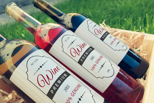
Searching for label designing tips that will enable you to send your product taking off the racks?
At AGI glaspac, we pride ourselves on making lovely glass bottle printing and "inking" for a wide range of brands. Despite the fact that we're known for our wide range of glass bottles starting from wine bottles, glass milk jars, and food jars, we likewise specialize in designing glass bottles. We've been in the business for quite a while, and in our long stretches of experience, we've realized the stuff to make a dazzling product that emerges on the shelves. So we're giving our master counsel to enable you to structure an ideal product label.
Here are some of our favorite product label design tips that will take your brand to the next level.
1. Keep it Simple
Keep your designs, images, and fonts simple and clean for maximum user experience. When your product label design has way too much going on, it’s going to throw off your customers. You don’t want people squinting to try to figure out what’s in the container. This is especially true for those customers who go straight to the nutrition facts label. You want to make it as easy as possible for them to find the information they’re looking for- otherwise, they’ll move on to another brand.
2. Use Color Wisely
Colors are essential for grabbing a customer’s attention during the “half-second window of opportunity.” People are more likely to stop in their tracks if you’ve got a nice color jumping out at them. However, color should be used properly in order to work for your product. Avoid the dreaded clash of colors. Focus on choosing complimentary colors that will go together. This will help your label stand out in a much more positive way. Keep your colors consistent. If you’re communicating flavors, stick with the colors that are associated with them. This helps your customers find the flavor they’re looking for easily, creating a better user experience. Try using a pop of color. When there’s a hint of color against a black or white background, it stands out easily. This works well when your brand colors are already black and white.


3. Select the Right Font
If your font is too generic, it just looks like you picked the first thing that came to your mind and put little to no effort or thought into the process. Don’t use too many fonts, either. It’s best to stick with 2 at the maximum to keep your label consistent and easy to read. Stick to the font you’ve already branded your company with. It’s easier for people to recognize and it’s consistent to your message. It’s also important to make sure you keep your font at a readable size. Your customers can’t read it if it’s too small. If you find yourself making everything smaller to fit everything on your label, that’s a good sign that you’re including way too much text. Go back and see where you can condense, shorten, or remove extra text.
4. Pick an Unusual Shape
When you use a non-standard shape on your bottle, it’s more likely to catch someone’s attention as they walk by. Many product labels follow a standard shape, usually a rectangle or a circle. Consider the shape of your packaging or container. Always make sure the shape fits with what you’re putting out. If it doesn’t fit the container size properly, that’s when you get those labels that start to peel, crack, or fall off. So if an unusual shape doesn’t fit your container properly, it’s not worth it.

5. Use High Quality Products
It doesn’t matter how amazing your design is if the quality is poor. The better your materials are, the better the impression you make to your customers. The design on a glass bottle is one thing, but when someone picks it up they can instantly tell that it isn’t a high-quality material. Your brand is a representation of who you and your company are. You’ve worked hard to build what you have, so spend the extra money and make sure you’re using the best materials possible.

6. Keep it Consistent with Your Brand
One of the most important things you need to do is solidify your brand identity. Think about the message your brand sends and the ideas you want to convey. When you sell sleek, modern, trendy products, you don’t want to include fonts and designs that make people think about their grandparents’ kitchen. Do the research on your target market, and your competitors, and pick something that caters to the right audience. If you already have a branded font and color scheme, always use that. It helps your customers recognize your product and keeps them continuing to choose your product in the future.
7. Provide Your Contact Information
Customers who have a positive, happy experience might want to go and visit your website or contact you to provide feedback. This is a great way to drive traffic to your website, increase calls to your storefront, or simply let customers express their satisfaction. Even if the feedback isn’t always positive, you still want to know where you could improve.
If you’re selling your product at a convention, festival, or other special event, you absolutely want contact information on your label so people can come back to you. When customers go home and enjoy your product, they want to know where they can find you to buy more.
8. Match the Packaging to Your Brand
You always want to stay consistent with the type of product you’re selling. For example, if you’re selling an organic line of naturally-sourced, raw food products, you want to use recycled, eco-friendly packaging. Otherwise, you’re completely missing your target market. When the brand and packaging match perfectly, you strike that emotional connection with your customers that make them happy to purchase your product.
9. Find a Unique Feature
One of the best ways to make your products stand out is to find something unique you can associate with your brand- something not many other brands are doing. Some brands like to use different images on all of their products, such as a different photograph on the label, like Jones Soda. This speaks to a consumer’s individuality, and also appeals to those collectors out there who simply have to have as many as they can. Other brands like to feature individual messages, like their personal story or a funny anecdote about making the specific product. Find something that your customers are going to want to collect that will begin to represent your brand. One example of this is James Ready, a Canadian beer brand of Moosehead Brewing Company. Under every beer bottle cap, there’s a fun message printed. These messages have become synonymous with the company and its product.
10. Print Your Designs Directly on the Bottle
If your design is printed directly on the bottle, your product is definitely going to stand out. When a label is part of the bottle itself, those fine lines and details are clearer and easily seen by your customers. Not only that, but your customers will associate your product with a higher-quality, premium option that appeals more to their wants and needs. This also helps to ensure that your branding and label don’t peel off, fold over around the edges, or become ripped.
*Source : Stanpac